Beazley Designs of the Year
Designs of the Decades
As we move into a new decade, the Design Museum looks back at Designs of the Year winners from this century so far - and the ones that "got away".
#beazleydesignsoftheyear
GOV.UK website
The one that won...
Date: Overall winner, 2013
Designed by: Government Digital Service
The official website, GOV.UK was the first non physical project to win the design of the year award, an important step in moving away from an analogue view of the world. It's accessible, economical, and offered a great example of Britain doing things well. The fact that it uses a version of a classic Margaret Calvert font was a particularly nice touch, but it’s the clarity of thinking that makes the site such an effective front door for the country.
- Deyan Sudjic, Director

iPhone
The one that got away...
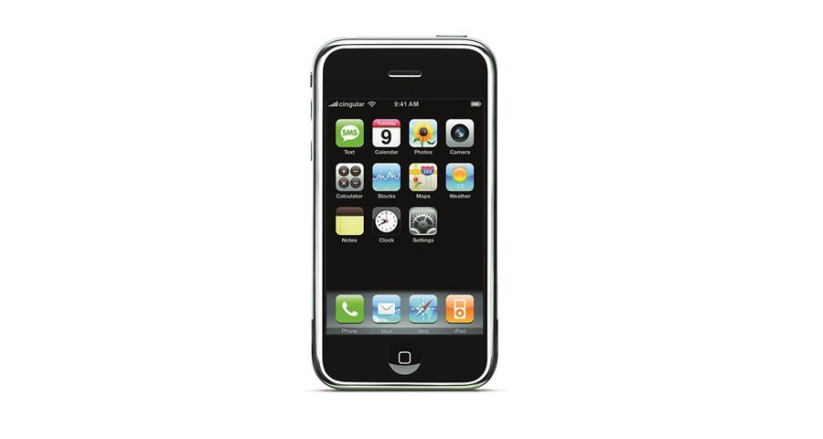
Date: Product category, 2008
Designed by: Jonathan Ive for Apple Inc.
What was the jury thinking when they recognised the first generation Apple’s iPhone only as a category winner rather than the design of the year, or the design of the decade for that matter. This was the first real smart phone, which the design for better or worse has changed everything, in ways that even Steve Jobs and Jony Ive could not have fully predicted.
- Deyan Sudjic, Director
Anatomy of an AI System
The one that won...
Date: Overall winner, 2019
Designed by: Kate Crawford of AI Institute and Vladan Joler of SHARE Lab.
The reason why this year’s winner is such an important marker is precisely because it is not an object. Instead, it’s a project that reveals the underlying system behind an object: the Amazon Echo. Millions of people have Amazon voice assistants in their home, and if they thought about the “design” they would immediately alight on its form or its ease of interaction. Very few would think about how the rare earth materials were mined, the human labour that goes into making it or the kinds of information that it extracts from the user.
In one diagram, Anatomy of an AI System, by Kate Crawford and Vladan Joler, illustrates just how complex and costly a piece of consumer AI is – both socially and environmentally. This understanding of the systems behind objects is exactly the leap that designers – and society at large – need to take if we are going to build an ethical and sustainable society. We need to get behind the look of objects and understand their impact from birth to death.
- Justin McGuirk, Chief Curator
The hashtag
The one that got away...
Designed by: Chris Messina, who posted the first hashtag on Twitter in 2007:
"How do you feel about using # (pound) for groups. As in #barcamp [msg]?"
The hashtag has become a new mode of thinking. It was only in 1998 that the International Telecommunications Union made hash signs a chosen standard on every single phone. Smartphones and social media mean it can now turn a word into a meme, a marketing device, a tool for gathering information and a way to galvanise millions of people. And the beautiful thing about it is that it was not a centralised design decision, it was we users of social media who made it into the phenomenon it has become.
- Justin McGuirk, Chief Curator

The Smithsonian National Museum of African American History and Culture (NAAHC)
The one that won...
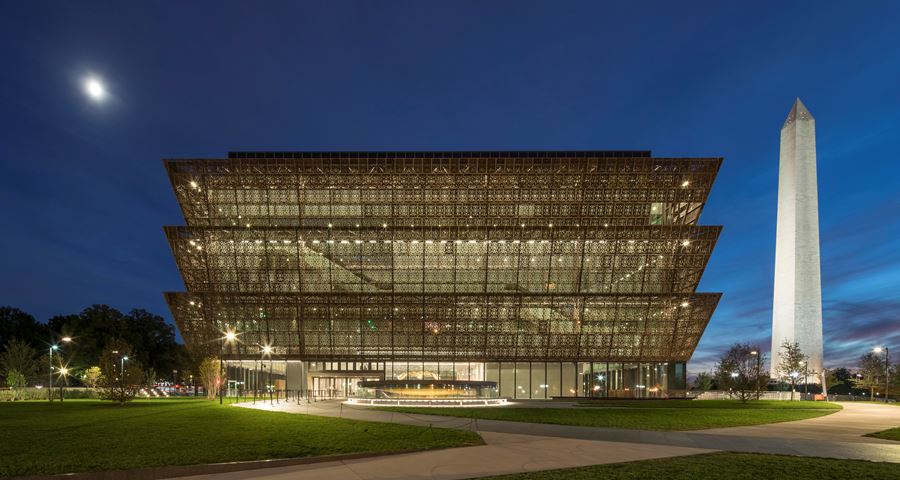
Date: Overall winner, 2018
Designed by: Adjaye Associates
My champion of champions is Smithsonian National Museum of African American History and Culture by Adjaye Associates. This museum is dedicated to telling the story of black Americans’ lives, from slavery to the present day. The museum was inaugurated by President Obama in September 2016 on the last available plot at the National Mall in Washington D.C. It is a long-awaited symbol of the African American contribution to the nation’s history and identity. Visitors enter the lowest levels of the building, exploring the complex story of slavery and emancipation. They then work their way up through history of segregation and the civil rights movement, to a celebration of African American history.
The architecture supports these narratives by carefully choreographing visitors’ experiences: below ground the mood is a contemplative memorial space with cascading water. Above ground, as the exhibits transition from themes of oppression to celebration, spaces are bathed in natural light and built from a diverse palette of materials. The tiered exterior of the building is inspired by the sculptures of early 20th-century Yoruba artist, Olowe of Ise. David Adjaye thrives on a complex brief and you feel his profound skill throughout this building.
- Josephine Chanter, Director of Audiences
The High Line
The one that got away...
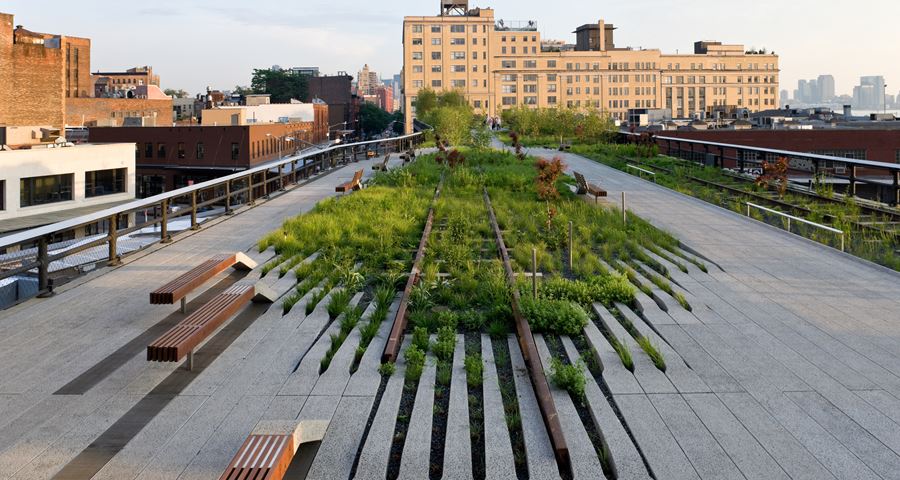
Date: Architecture category, 2010
Designed by: James Corner Field Operations, Dillier Scofidio + Renfro and Piet Oudolf of the City of New York and Friends of the High Line
The High Line didn’t win in 2010 in favour of a prototype folding plug. The High Line is a remarkable phenomenon, its success has created a whole new interest reclaiming and re-purposing the space above our heads in cities all over the world. As well as being a great space in itself, the High Line has set a precedent that helps us in our ambitions to make our cities more 3D, more walkable and more connected. The folding plug on the other hand, has yet to emerge triumphant.
- Josephine Chanter, Director of Audiences
Plumen 001
The one that won...
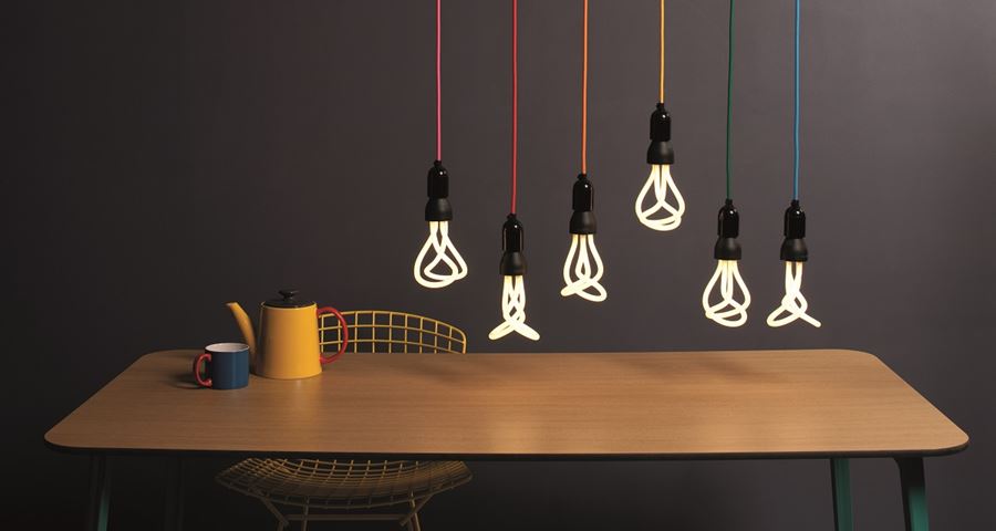
Date: Overall winner, 2011
Designed by: Concept and design direction by Hulger; designed by Samuel Wilkinson
The Plumen 001 bulb showed the world that low-energy lighting could be beautiful as well as efficient. Since winning in 2011, Plumen have gone from strength to strength, releasing new designs that consolidate their position as market-leaders in lighting innovation.
- Duncan Sanders, Head of Trading
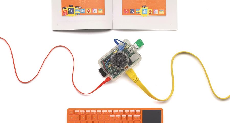
Kano Computer Kit
The one that got away...
Date: Product category, 2015
Designed by: Technology Will Save Us
This neat kit has continued to inspire children and adults alike – giving the end user a really solid understanding of the inner workings of the computer, and providing a robust base upon which to explore wider themes in IT innovation.
- Duncan Sanders, Head of Trading
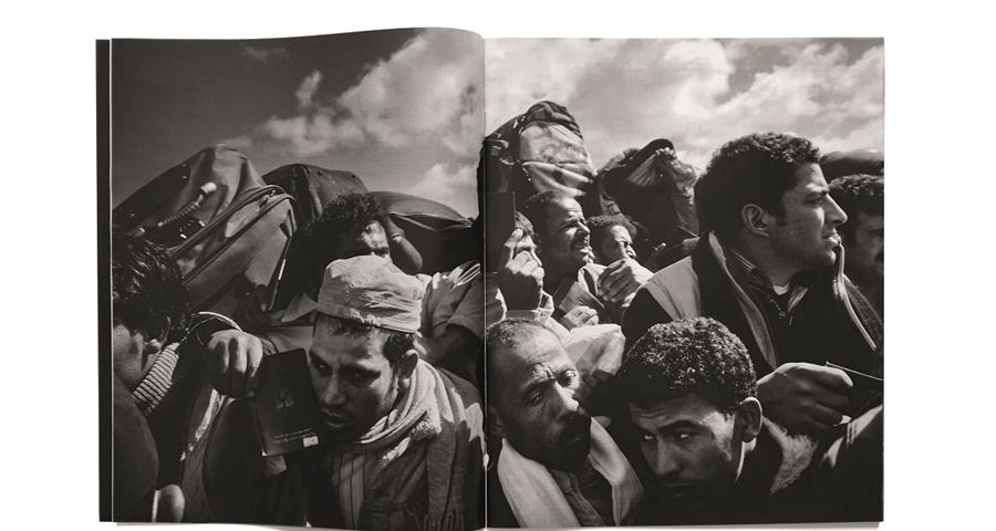
'Fractured Lands', The New York Times Magazine , 14 August 2016
The one that won...
Date: Graphics winner, 2017
Designed by: Editor-in-chief: Jake Silverstein; design director: Gail Bichler; art director: Matt Willey
A ground-breaking collaborative project, Fractured Lands was a rigorously argued admonition to the ecosystem of daily violence that has raged across the Middle East for the past decade. Designed by art director Matt Willey, with photographs by Pellegrin and a virtual-reality experience by Solomon, readers were journalistically and visually transported from Firdaus Square to Humvees and beyond. The austere monochrome book-like feel reflected life with its outer edges on the brink, but with the dignity of those suffering at the centre upheld – a remarkable example of an aesthetic approach with a strong ethical sensibility.
- Maria McLintock, Assistant Curator
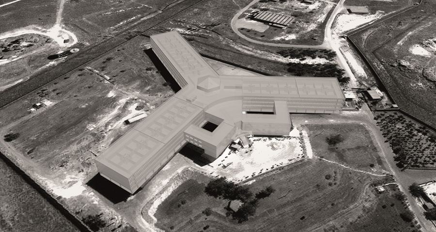
Saydnaya: Inside a Syrian Torture Prison
The one that got away...
Date: Digital category, 2017
Designed by: Forensic Architecture and Amnesty International
In a year when revelations about the prominence of fake news and misinformation plagued our headlines, this project powerfully exemplified why the pursuit for truth can be the difference between life and death. Amnesty International worked with Forensic Architecture and ‘private ear’ Lawrence Abu Hamdan to reconstruct Saydnaya, a prison 25km north of Damascus in Syria, where over 13,000 detainees have been executed since protests against the Assad regime began in 2011. This poignant reconstruction of the site demonstrates that ear witness testimonies have become a crucial form of evidence and, here, serve as the only resource available from which to learn of the gross human rights violations at work.
- Maria McLintock, Assistant Curator
Related exhibition